MySivi Home Screen Redesign
Improving clarity, exploration, and engagement for a 10M+ user English learning app.
MySivi is an AI-powered English learning platform for 10M+ users to discover, practice, and stay motivated.
Role
Product & Growth Design
Timeline
10 weeks
Impact
10M+ learners
Overview
The home screen is the most important surface in MySivi. It is where users decide what to do next.
When I joined, the product had around 4M users and was scaling fast. Today, it serves 10M+ users.
The existing home experience was not keeping up with that scale. Users were landing on the screen but not exploring further.
This project focused on fixing that by making the experience clearer and more inviting.
The challenge
Users were visiting the home screen but leaving before exploring. The interface did not make the next step obvious.
| Problems | Goals |
|---|---|
| Users could not understand what this app offers. | Make the home screen easier to understand. |
| Users could not understand what to click. | Increase exploration and interaction. |
| Users could not understand what comes next. | Improve content discoverability. |
| Users felt overwhelmed by too many entry points. | Reduce decision friction with clearer entry points. |
| UI visuals were inconsistent and hard to scan. | Create a more consistent visual system for discovery. |
Understanding the problem
The issue was not feature count. It was the quality of the experience: users needed clearer pathways, stronger visual cues, and a simpler way to start.
Key insights
Users need direction, not options.
Visuals drive curiosity and clicks.
Structure matters more than volume.
Performance impacts perception.
Defining the goal
The main objective was to make the home screen easier to understand and to turn browsing into interactions.
Make the home screen easier to understand
Increase exploration and interaction
Improve content discoverability
Create a more engaging and motivating experience
Wireframes & layout exploration
The UX process began with low-fidelity layout explorations and wireframes to test content structure, navigation entry points, and the overall learning flow.
The early sketches explored different ways to surface goals, practice sessions, and quick-start actions. The final vertical layout was chosen because it performed best for clarity, scan ability, and smooth progression.
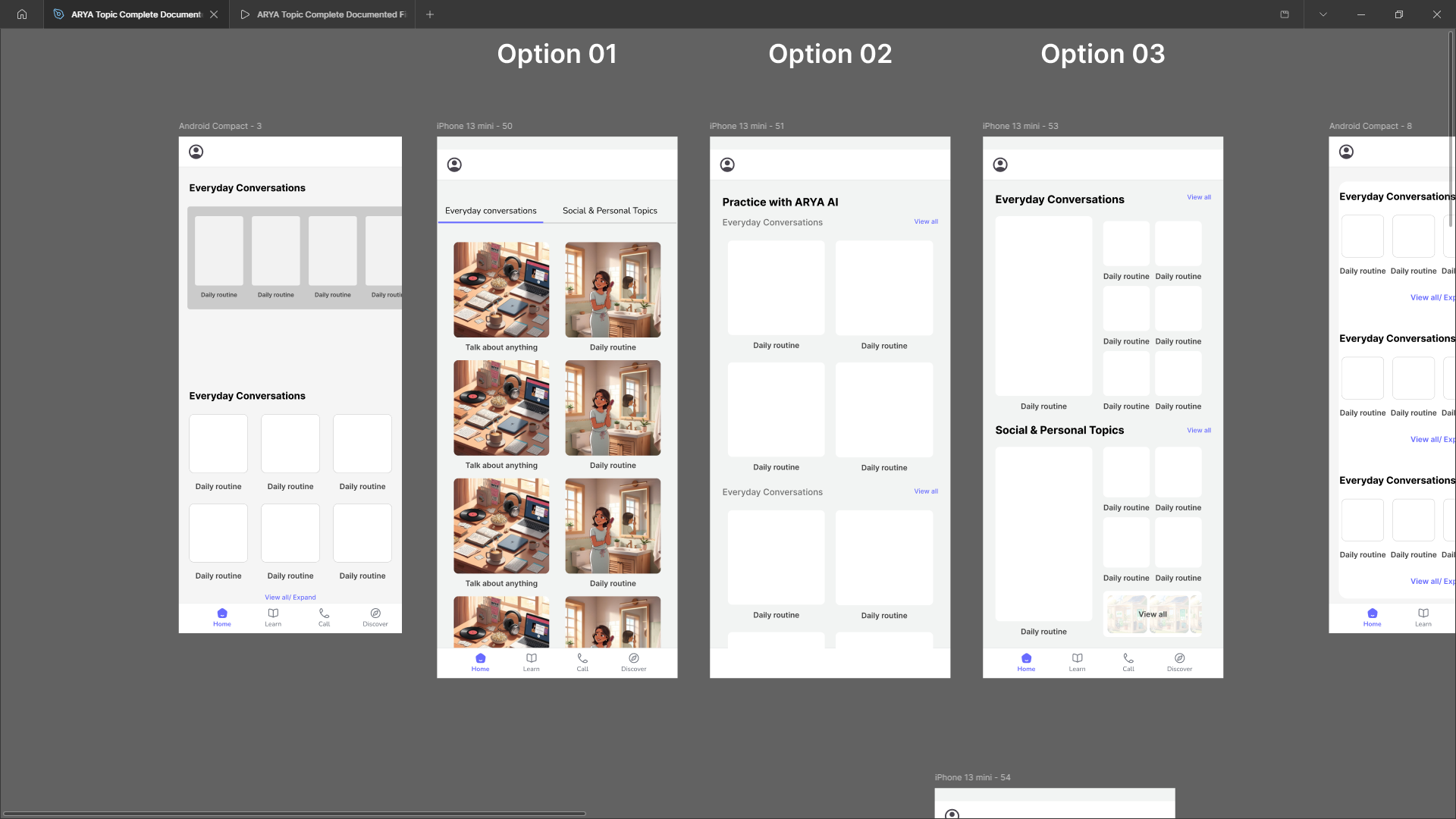
Early layout exploration
Initial structure tests considered a multi-column dashboard and a stronger hierarchy for the main tasks.
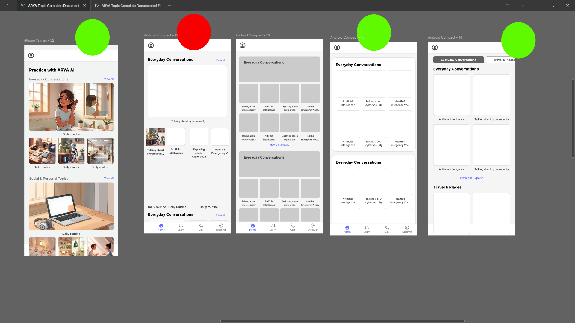
Content prioritization experiment
Tested different prominence levels for lessons, stories, and progress indicators.
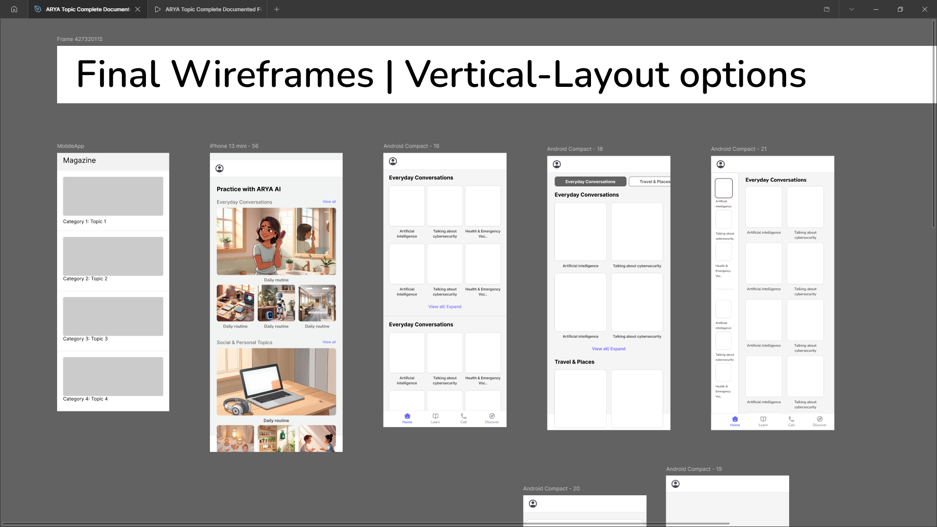
UX scaffolding and navigation
Explored how to make the home screen feel both approachable and clearly actionable.
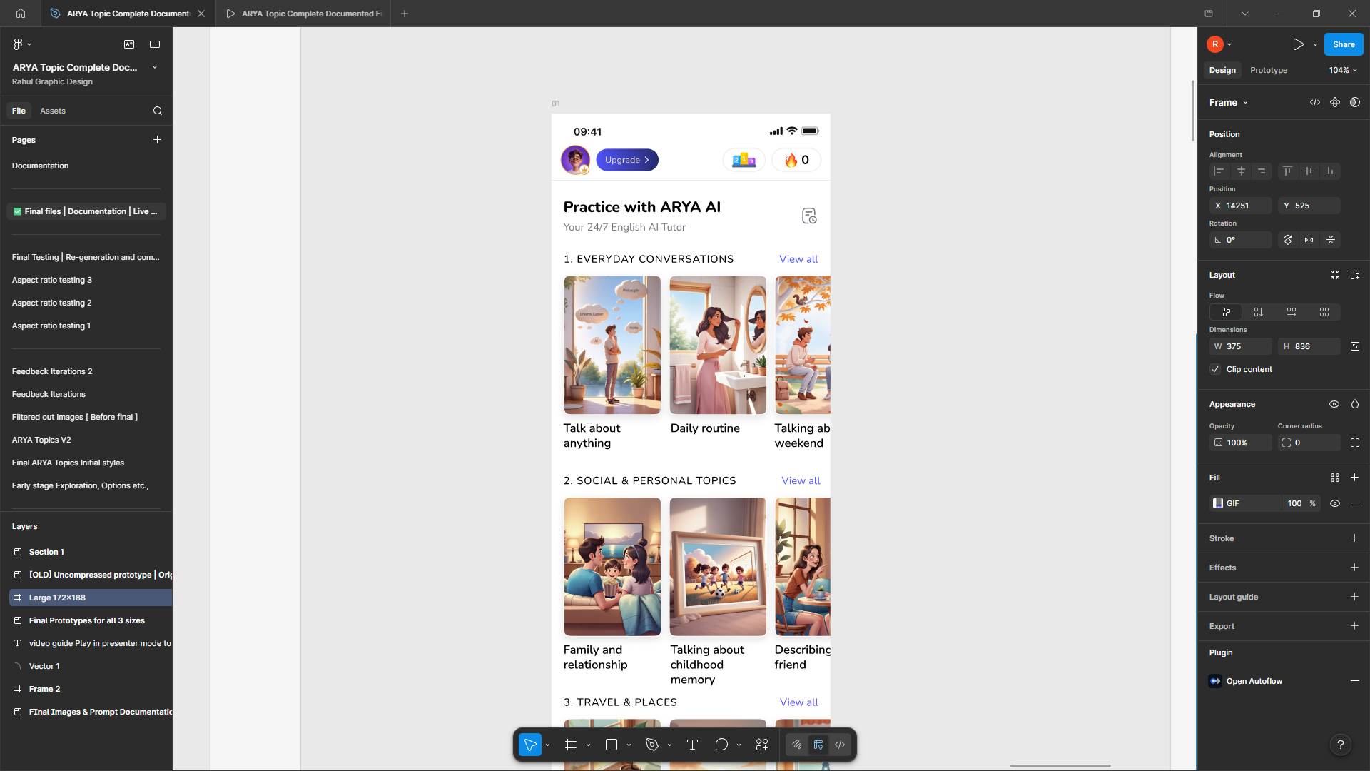
Final vertical layout
The finalized layout that combines a clear content hierarchy, digestible visual cards, and a natural scroll-based exploration path.
Design exploration
I tested eight visual routes to find the right balance between warmth, clarity, and learner motivation.
One early concept leaned into a Disney Pixar-inspired illustration style, but I moved away from it because it started to feel too playful and risked reading as a kids app rather than a confident learning platform.
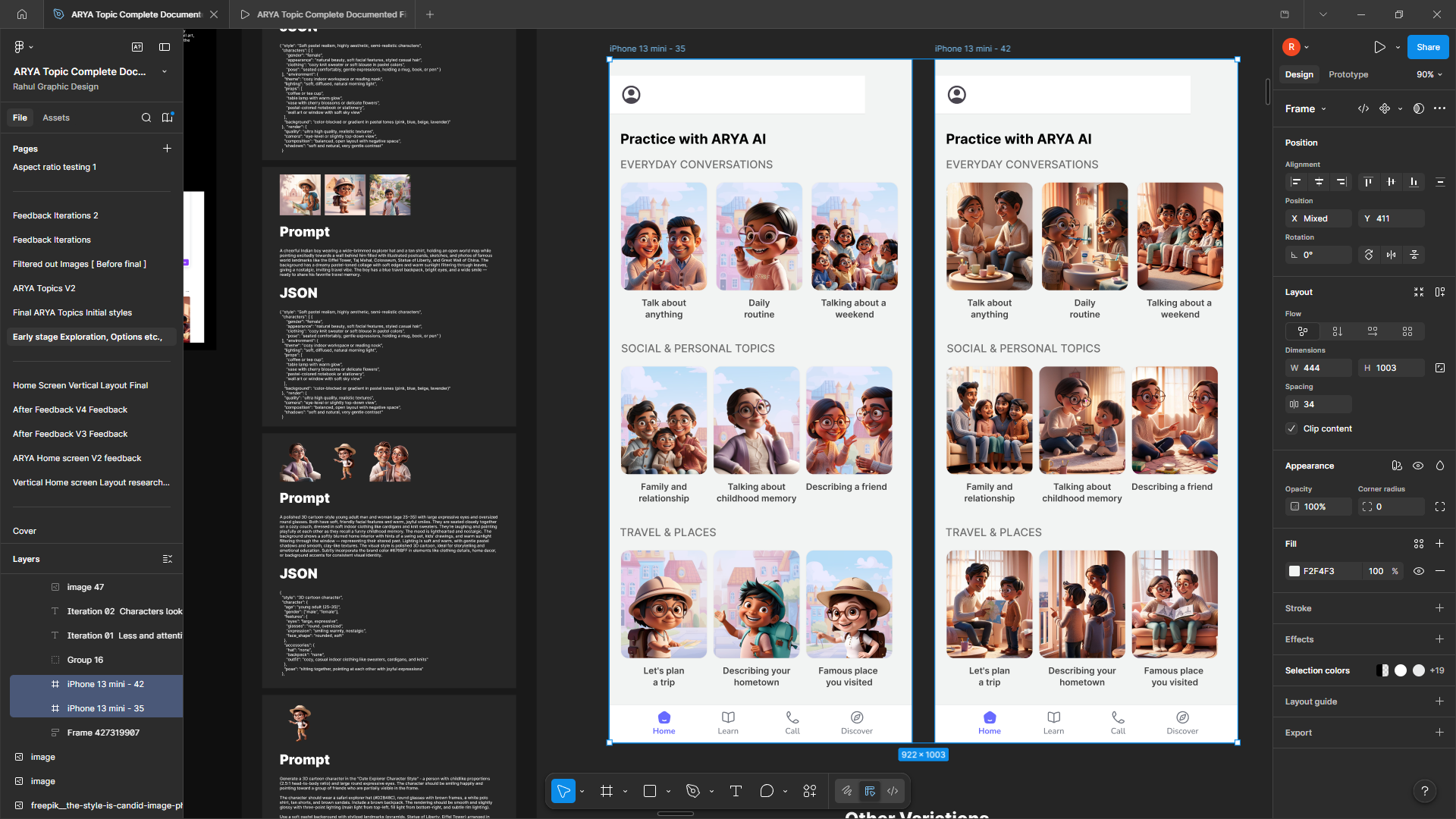
Disney Pixar
An early playful direction with bright, expressive illustrations and warm colors that evoked the charm of animated films. The style felt too young and risked positioning the app as a kids's platform rather than a mature learning tool.
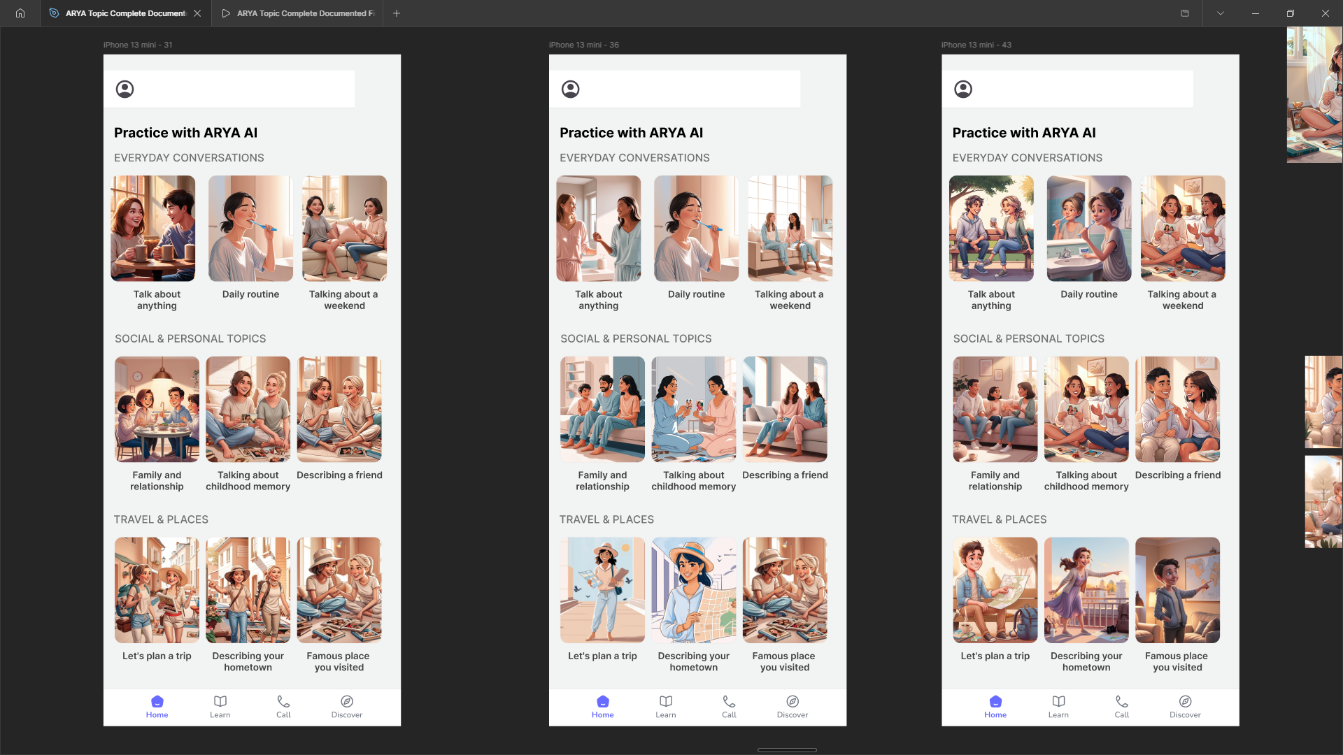
Comical art
A whimsical, cartoon-inspired approach with exaggerated characters and playful compositions. While engaging, it diluted the serious intent of the learning experience.
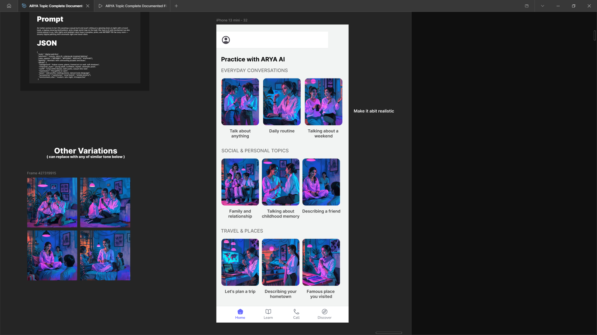
Neon style
A vibrant, high-contrast visual language using bold neon accents and electric colors. The aesthetic was energetic but felt disconnected from the warmth needed for an inclusive learning platform.
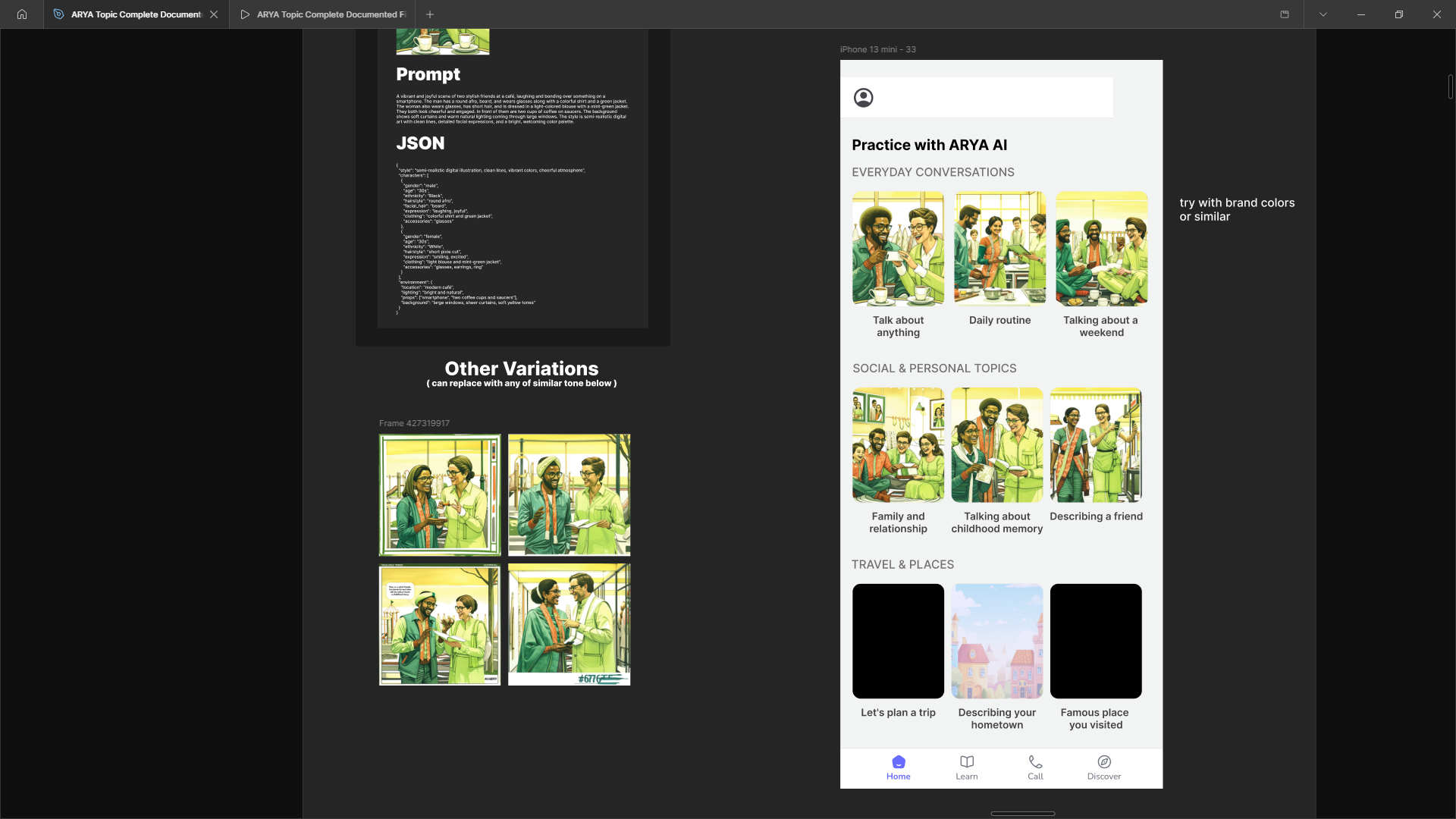
Retro comic style
A vintage-inspired approach with halftone textures, bold linework, and retro color palettes. It had personality but felt nostalgic in a way that could confuse younger learners about the platform's purpose.
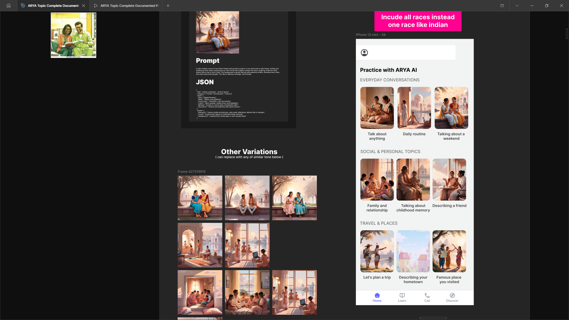
Hand Painting style
Organic, hand-painted illustrations with soft edges and naturalistic brushstrokes. The approach was warm but required high overhead for consistency across hundreds of lesson variations.
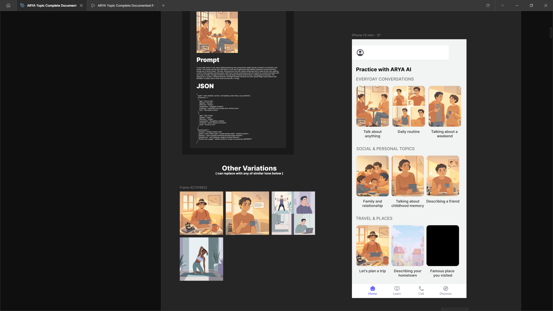
Ghibli
Inspired by the soft, detailed animation style of Studio Ghibli with muted palettes and emotive character expressions. It was visually beautiful but carried strong cultural and narrative associations that didn't align with a global learning platform.
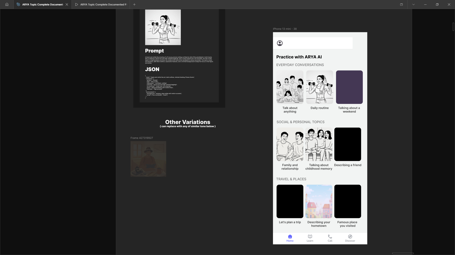
Monochrome
A minimalist, single-color approach emphasizing typography and negative space. It felt too austere and didn't convey the warmth and approachability needed to encourage engagement.
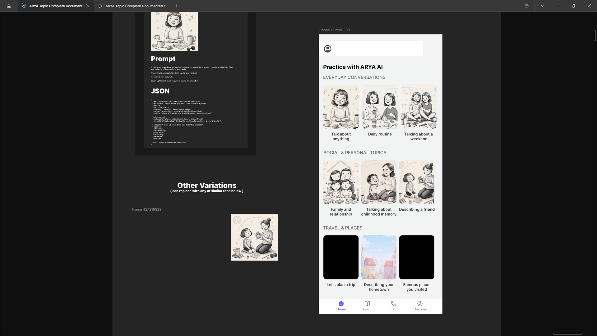
Pencil Sketching
Simple, sketch-like linework with hand-drawn qualities and minimal color. The style was approachable but lacked visual impact and clarity needed for quick scanning on mobile.
Key decisions
- Shift to a vertical feed so users could explore content in a familiar scrollable flow.
- Build a visual-first system to communicate meaning quickly and reduce reading overhead.
- Standardize visual style with consistent spacing, color, and typography across categories.
- Use clear aspect ratios to make cards predictable and easier to scan.
The solution
The new home screen guides users through content with stronger visual topics, simpler structure, and a clear next step.
The new home screen uses a more consistent mobile frame, stronger card geometry, and clearer visual anchors so users can move from browsing to activity faster.
By matching the same format and scale as the before/after screen, this section highlights the actual flow and makes the improvements easier to compare.
Visual topic cards: Each topic is clearly represented and easy to understand.
Structured vertical feed: Content is grouped and scrollable, reducing decision friction.
Clear hierarchy: Users can quickly understand what to do next.
Before vs after
Old home screen experience with lower clarity and weaker visual direction.
Updated home screen with clearer structure, visual cards, and stronger exploration cues.
Design system
We built a reusable design system that supports consistent topic cards, category colors, spacing rules, and performance-aware asset handling.
- A shared card layout and visual vocabulary for every feed item.
- Category mapping and color rules to make topics instantly recognisable.
- GenAI asset guidelines to keep imagery consistent and performant.
- Design rules that make future scaling easier and more predictable.
Expected Impact
This redesign is yet to be deployed. The following outcomes are based on UX principles and observed user behavior, and represent expected improvements.
✅ Home Clarity
Improved hierarchy and reduced clutter make key actions easier to identify.
✅ Path Discoverability
Clearer grouping and navigation cues help users find the next step faster.
✅ Motivation to Explore
Better content presentation encourages deeper interaction.
✅ Reduced Confusion
Simplified layout minimizes ambiguity and decision friction.
What I learned
- Clarity is the most powerful lever on a crowded home screen.
- Visual direction beats feature lists when users need to choose quickly.
- Reusable rules help the design stay consistent as the product scales.
- Performance-aware visuals are essential for momentum in fast-moving feeds.